Creating a vintage-style film noir poster
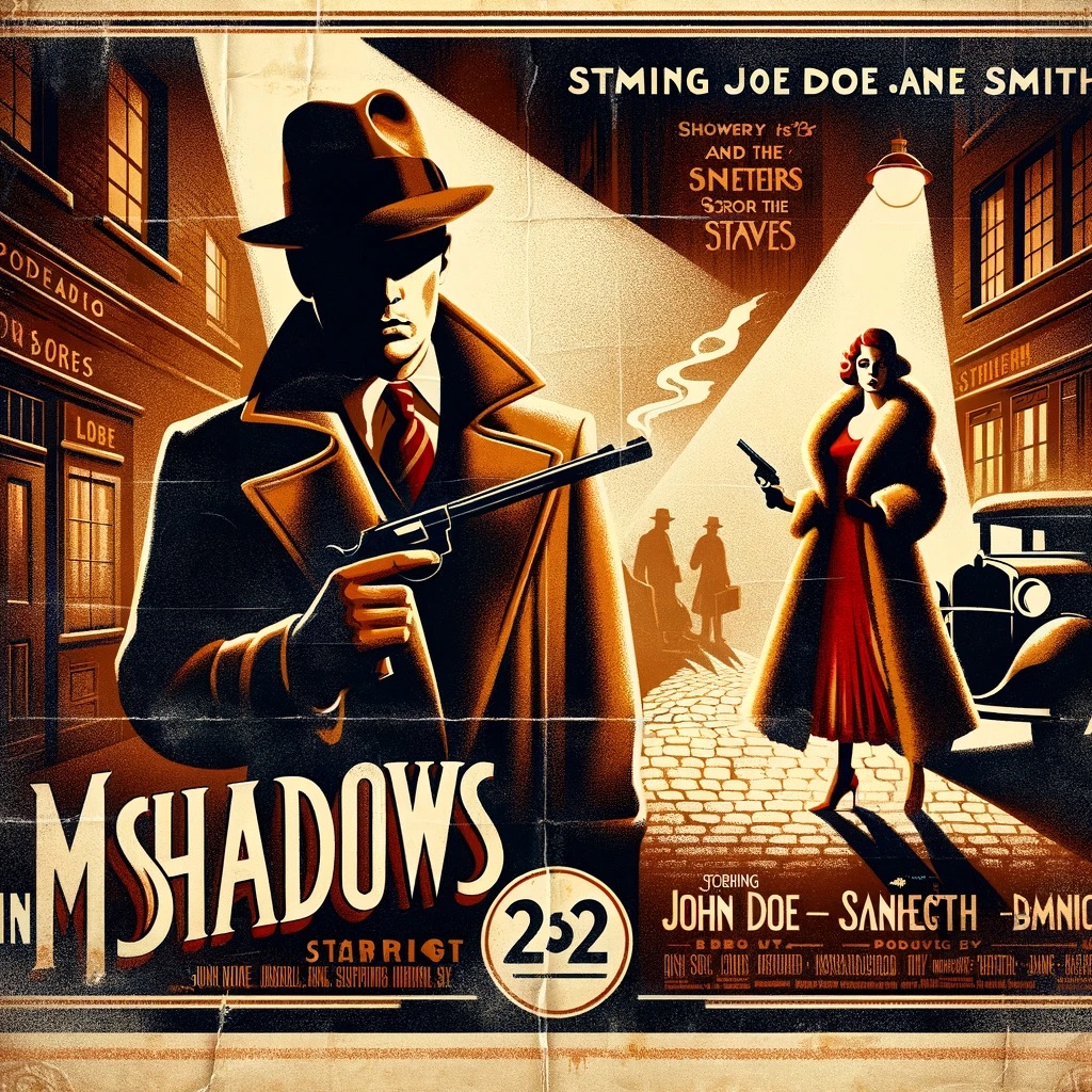
Creating a vintage-style film noir poster involves careful attention to detail and a deep understanding of the aesthetic qualities that define the era, particularly those associated with film noir. The poster for “Mystery in Shadows” exemplifies this approach, showcasing a dramatic scene set in the 1930s. The central image captures the essence of film noir with a man in a fedora and trench coat, holding a smoking gun in a dark alleyway lit by a single streetlamp. The woman in a red dress and fur stole peeking around the corner adds an element of intrigue and danger, hallmarks of the film noir genre.

The title “Mystery in Shadows” is prominently displayed at the top in an art deco font, instantly evoking the period’s style. Beneath the title, the names of the stars, John Doe and Jane Smith, are presented in smaller text, maintaining the visual hierarchy. The poster’s bottom features a classic billing block with production credits, providing authenticity and completeness.
The color palette is dominated by muted earth tones, with strategic accents of red and yellow to draw attention and add contrast. The overall distressed and aged appearance, complete with creases and slight discoloration around the edges, enhances the vintage feel, making the poster look like it has been a cherished artifact from a bygone era.
To create such a poster, one must start with a clear concept that aligns with the stylistic elements of the desired period. Selecting appropriate fonts, color schemes, and compositions is crucial. Digital tools like Adobe Photoshop or Illustrator can be used to simulate aging effects, such as adding creases, discoloration, and texture. Incorporating period-appropriate attire and settings in the imagery further solidifies the vintage aesthetic. The final step involves layering these elements cohesively to achieve an authentic and visually compelling piece of art, capturing the timeless allure of film noir.